A new page has been added onto the app that serves as a "homepage"! We're excited to roll this out which will help you have a quicker access to your dashboard and to ensure a smoother experience on OnlyDust.
Depending on whether you are a contributor, project lead, or visitor, you will see different homepage dashboards when you come onto the app!
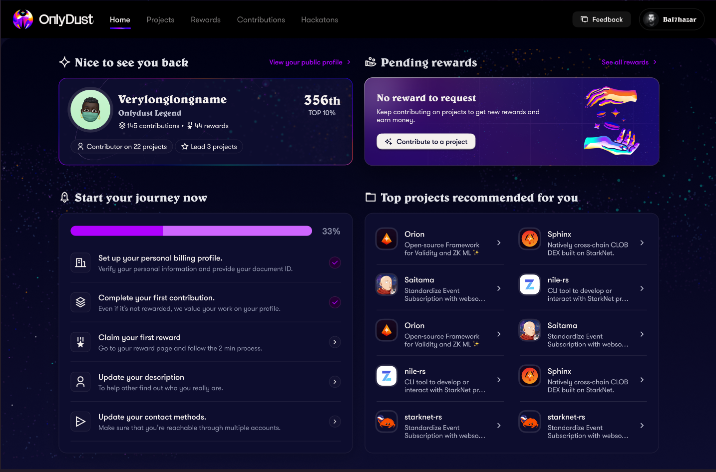
As a contributor, you'll be able to see a contributor profile card where you can see:
- your pending rewards,
- top projects recommended for you (yay! 🎉),
- a recap of all "first tasks" that you need to complete in order to get fully started!
For the last bullet point (image below), we have provided a list of things to do that will help you start your journey. Once each task is completed, you will no longer see this card!
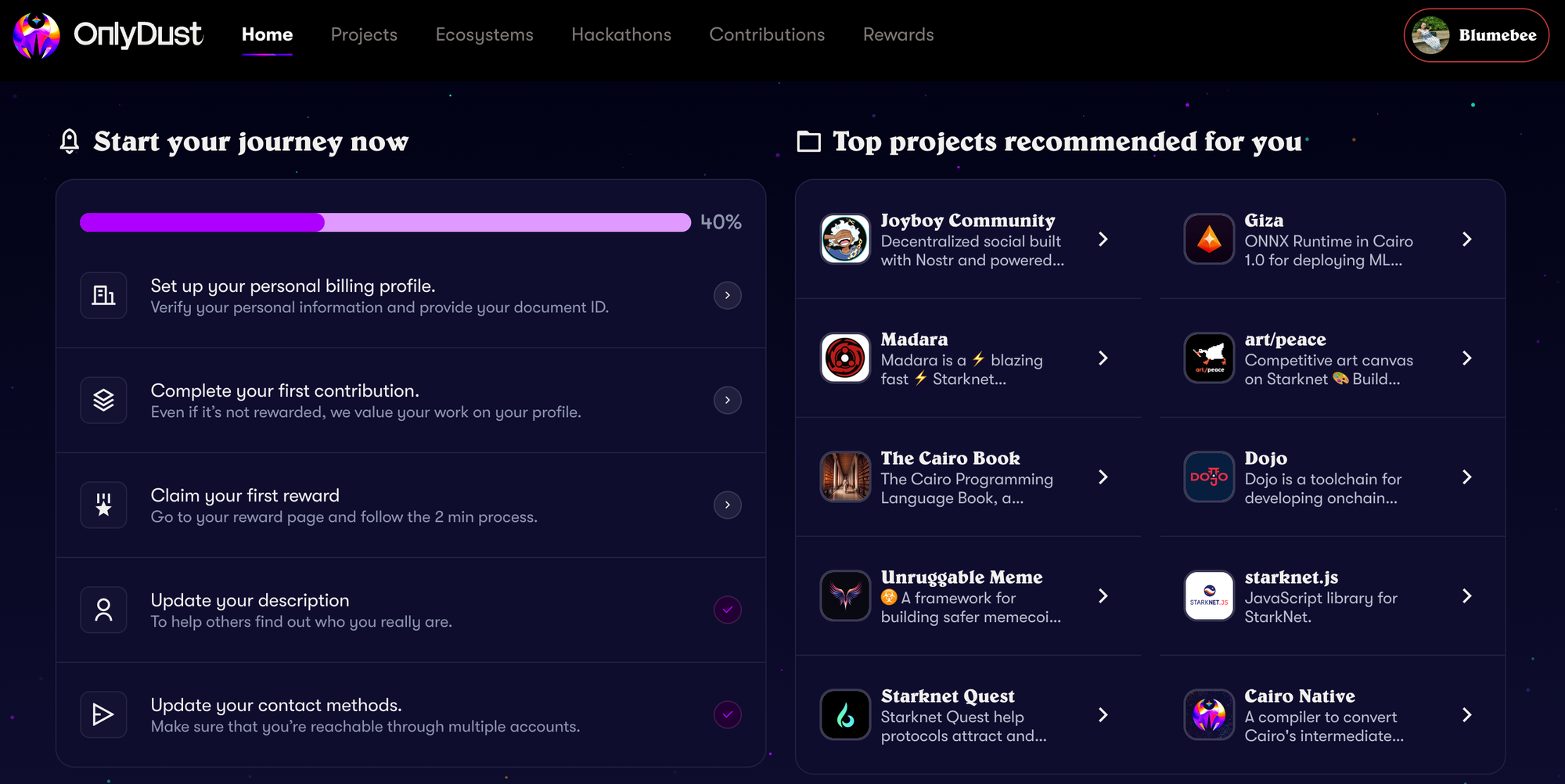
You will then be left with an overview of your pending rewards and the top projects recommended for you. You will also notice that we have placed a CTA to see your public profile, where the information of your language skills and activity can be seen.
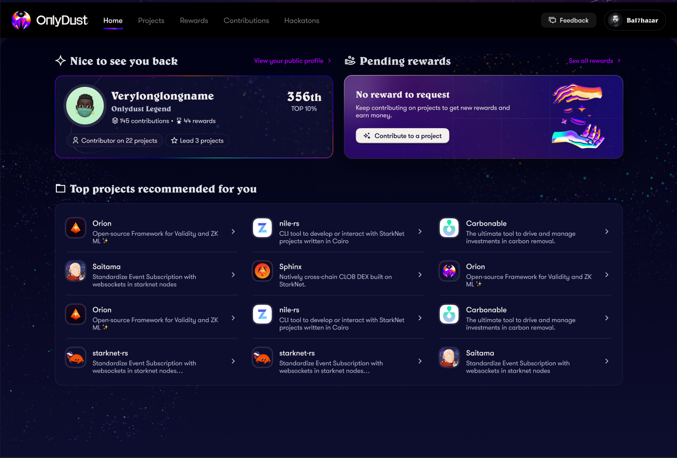
Note that in the pending rewards section, you will be able to see rewards that are awaiting for a request. All you have to do is click to go to the rewards page and fulfil your actions! Regarding the top projects recommended for you, you can easily click on a project and take it from there 😄!
Now, as project lead, you have the exact same thing, except that you'll be able to see the projects that you manage!
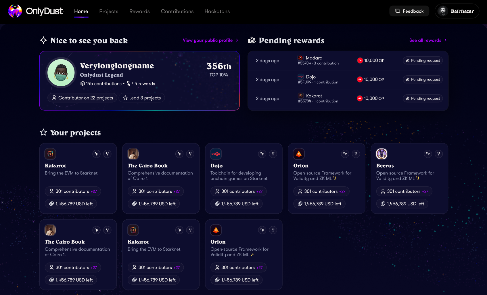
For each project that you manage, you will be able to find the name, the description, the number of contributors that you have (and its evolution!) as well as the current budget left in $ equivalent.
Not bad for a quick overview, huh?!
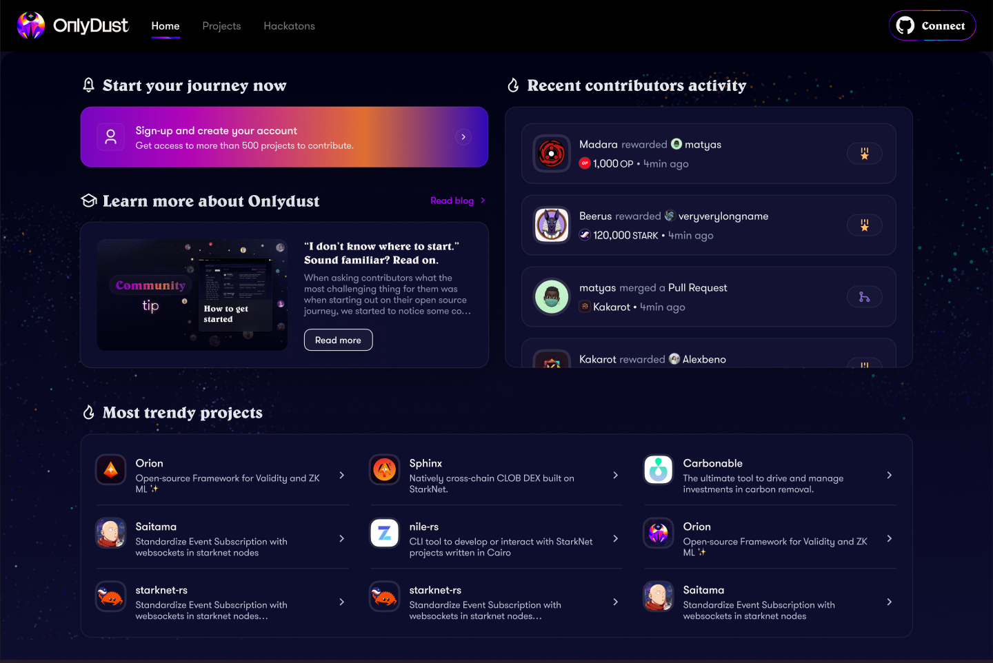
And when you are a newcomer eager to join but haven't signed up yet (or logged out) the below image is what you will be able to see!
A way to start your journey, a section regarding recent contributors activity, our blog post ❤️ and the most trendy projects in the space currently.
